Quantcast
Channel: Tableau – Michael Sandberg's Data Visualization Blog
Viewing all 292 articles
Browse latest View live

Stephen Few’s Review of Tableau 8: Tableau Veers from the Path

$
0
0

The first person who exposed me to best practices in data visualization was Stephen Few. I had the good fortune to take a one day Data Visualization class from him in 2007 at TDWI in San Diego. Stephen’s company is called Stephen Few, Perceptual EdgePerceptual Edge.

Stephen founded Perceptual Edge as a consultancy that was established to help organizations learn to design simple information displays for effective analysis and communication. With 25 years of experience as an innovator, consultant, and educator in the fields of business intelligence and information design, Stephen is now a leading expert in data visualization for data sense-making and communication.

He writes a quarterly Visual Business Intelligence Newsletter, speaks and teaches internationally, and provides design consulting.  In 2004, he wrote the first comprehensive and practical guide to business graphics entitled Show Me the Numbers, in 2006, he wrote the first and only guide to the visual design of dashboards, entitled Information Dashboard Design, and in 2009 he wrote the first introduction for non-statisticians to visual data analysis, entitled Now You See It.

With that introduction to Stephen Few, I wanted to provide you a link to his web site and his review of Tableau 8. Here is a brief snippet of Stephen’s review.

“I’ve seen it happen many times, but it never ceases to sadden me. An organization starts off with a clear vision and an impervious commitment to excellence, but as it grows, the vision blurs and excellence gets diluted through a series of compromises. Software companies are often founded by a few people with a great idea, and their beginnings are magical. They shine as beacons, lighting the way, but as they grow, what was once clear becomes clouded, what was once firm becomes flaccid, and what was once promising becomes just one more example of business as usual.”

Regards,

Michael


Filed under: Business Intelligence, Stephen Few, Tableau, TDWI, The Perceptual Edge, Uncategorized

Gartner Magic Quadrant for Business Intelligence on Tableau Public

Tableau 8: The Kraken, Bubble Maps and Andy Cotgreave

$
0
0

krakenThe Kraken

One of the great sea monsters of Norse myth and legend is the Kraken, said to be able to overturn ships and drag them down into the cold depths. There seems to be a degree of confusion with the Midgard Serpent, because some legends say there are only two Kraken in existence, and that these were born in the first creation and are destined to die only when the world itself finally perishes. This seems to be what Alfred Lord Tennyson (1809-1892) had in mind in his poem The_Kraken. [SOURCE]

However, there are less apocalyptic tales about the Kraken – in particular about the ‘young Kraken’ – that contradict this, suggesting something on a lesser scale than the Midgard Serpent, though still scary enough. In the mid, I8th century Erik Ludvigsen Pontoppidan (1698-1764), Bishop of Bergen, tackled the long and hazy tradition of the Kraken in his Natural History of Norway (1752-1753). After scrupulously interviewing mariners he came up with this remarkable tale, which repeated a tradition that can be traced back to the 12th century but is certainly much older.

Fishermen told Erik Pontoppidan that sometimes when they rowed several miles out to sea, particularly on hot, calm summer days, they found that in areas where they were used to sounding a depth of 80-100 fathoms (50-60m), they would find it registering less than half this. If the fish were also jumping, the fisherman guessed that the Kraken was lurking below, stirring them up. So, while keeping a careful watch on their depth, lines, the men would gratefully catch fish until the monster showed signs of rising to the surface. Then they would haul in their nets and paddle for their lives.

Once clear they would rest on their oars and, as Pontoppiaan tells it, they would soon see an enormous monster rise to the surface – a creature so vast that no one could see the whole of it at once. The bishop says that it had the appearance of a number of small islands surrounded by something resembling seaweed: ‘At last several bright points or horns appear, which grow thicker and thicker the higher they rise above the surface of the water, and sometimes they stand as high and large as the masts of middle, sized vessels. It seems these are the creature’s arms and, it is said, if they were to lay hold of the largest man,of1war, they would pull it down to the bottom. After this monster has been on the surface of the water a short time, it begins slowly to sink again, and then the danger is as great as before, because the motion of this sinking causes such a swell in the sea, and such an eddy or whirlpool, that it draws down everything with it.’ This curiously symbiotic relationship with the Kraken is explained by Pontoppidan: “The Kraken have never been known to do any great harm, except that they have taken away the lives of those who consequently could not bring the tidings.”

Presumably he meant there were legends of ships and sailors being attacked, but that this was rare and never occurred in the circumstances he describes above. He personally heard only one close anecdote: two unwary fishermen suddenly ran into a ‘young Kraken’, one of whose ‘horns’ or tentacles ‘crushed the head of the boat, so that it was with great difficulty they saved their lives on the wreck, though the weather was as calm as possible’. Writing as he was in the Age of Enlightenment, Pontoppidan was laughed to scorn by many naturalists who thought he had fallen for a bunch of fishermen’s yarns. About the only part of his report seriously was his mention of the ‘young Kraken’. This creature was well known to Norwegian fishermen; to judge by their descriptions, ‘young Kraken’ are quite clearly ordinary squid. But, although evidence was then emerging that squid could grow much larger than previously imagined, the suggestion that one might have a circumference of over a mile remained outrageous. Some rationalists suggested – as in other cases of supposed monsters surfacing at sea – that what the fishermen were talking about, in a garbled and fanciful way, was simply the surfacing of weed tangles, buoyed up by the gases of their own decomposition. But most people simply laughed the tales away.

Proof of a kind that Pontoppidan’s sailors may not have been exaggerating came in a curious way during the Second World War. While hunting for German submarines off the coast of Norway, ships of the US Navy found a strange conundrum. Sometimes in areas where they knew the depth to be over 150 fathoms (90m) their sonar would indicate a much lower figure. Closer investigation showed that this phantom layer would rise gently towards the surface at night, then sink during the day. This suggested some kind of dense blanket of living organisms maintaining temperature by adjusting their depth.

The phenomenon is still unresolved but a reasonable suggestion is that it was probably caused by large schools of squid fanning out all at the same depth. And, if such a shoal surfaced, it might well appear, as Pontoppidan wrote, ‘like a number of small islands, surrounded with something that floats and fluctuates like seaweeds’. So is the Kraken in the end no more than a large school of squid breaking the surface? Well, possibly, squid are continuing to surprise us by the size they can reach. One wonders, too, about the phantom submarines which both sides chased occasionally in Scandinavian waters during the Cold War. Perhaps squid may indeed reach a size still not fully appreciated by either science or the world in general, and thus be the true Kraken.

Next: Andy Cotgreave rearranges 7,596 circles into a Kraken engulfing an orange submarine.


Filed under: Andy Cotgreave, Circles, Data Visualization, Kraken, Lord Tennyson, Tableau

Tableau 8: The Kraken, Bubble Maps and Andy Cotgreave – Part II

$
0
0

acotgreave_1356108152_71Andy Cotgreave

Andy Cotgreave is Tableau Software’s senior data analyst in the UK. With 16+ years experience battling with good and bad Business Intelligence (BI) tools, Andy has held positions in data analysis, business research and software development. Prior to Tableau, he was a senior data analyst at the University of Oxford. He has also served in positions at Fast Track, RCP Consultants and RM PLC, giving him a diverse range of technical and non-technical skills. He’s a frequent speaker and has spoken at conferences including Strata London, Oxford Internet Institute and News:Rewired. Andy is a graduate of the University of Edinburgh and holds an MA in Geography.

“Waiter, there’s a Kraken in my bubble map!”

Andy rearranged 7,596 circles into a Kraken engulfing an orange submarine. To see an interactive version of this visualization and learn a little more about how he did it, click on the image below.

Kraken bubble map


Filed under: Andy Cotgreave, Bubble Map, Circles, Data Visualization, Kraken, Tableau

Tableau: Ben Jones – Remixing it up in New York

$
0
0

Ben JonesBen Jones is a Tableau Public Product Marketing Manager with Tableau Software. Ben recently spoke at Data Visualization New York. I wanted to share some of Ben’s thoughts. You can also find the full article on his blog.

Ben’s presentation focused on how to use Tableau as a data discovery tool. Lucky for Ben, the amount of data about New York is as abundant as everything else about the city. There was no shortage of material, from garbage to graffiti to rat sightings and electric consumption. New York hiccups, and it gets recorded.

Ben Jones - Presentation

[Click on image to see slides]

Sharing data on the web with Tableau Public is both Ben’s job and his hobby, but this presentation allowed him to demonstrate how quickly Tableau allows users to find insights in data. Data discovery is a very important part of the overall process, which he conceptualized as a horse race track:

data_discovery

Ben made the analogy that using Tableau is like riding Secretariat – you get the distinct advantage of being able to race around the track a rapid rate, transitioning between the phases and quickly identifying patterns, outliers and trends in your data.

Ben also made a somewhat philosophical point that data is only one type of input in the overall learning process. Using data has its benefits and limitations. A benefit is that you can obtain valuable “explicit knowledge” – who, what, when and where? A limitation is that it’s often difficult to answer “why?” and “how?” using only data. Consider riding a bike: what’s a better way to learn, reading about it or doing it? And consider New York: no matter how many charts you see about the city, nothing replaces the unique experience of walking its streets and riding its subways. Tacit knowledge. Often the best outcome of data discovery is that you know what questions to ask in the analog world.

Here is a diagram showing the overall learning process, and how data fits in as a specific type of input:

learning_process

As pointed out earlier, there was a wealth of data to explore and visualize about New York. Ben explored a number of those data sets, and here are a few of the projects he recreated during the 1 hour time slot he was given at Data Visualization New York (focus was on learning, not fit & finish).

Click to open an interactive version:

1. “Know what” – Garbage data: DSNY Collection Tonnages (get the data here) dsny_collection_tonnages

2. “Know where” – The Bridges of NY & NJ (get the data here): bridges_ny_nj

3. “Know when” – Rat sightings in NYC (get the data here) rat_sightings


Filed under: Ben Jones, Data Visualization, Tableau

Robert Kosara, EagerEyes and the Bikini Chart

$
0
0

Robert KosaraRobert Kosara

Robert Kosara is a Visual Analysis Researcher at Tableau Software, and formerly Associate Professor of Computer Science at UNC Charlotte. He has created visualization techniques like Parallel Sets and performed research into the perceptual and cognitive basics of visualization. Recently, Robert’s research has focused on how to communicate data using tools from visualization, and how storytelling can be adapted to incorporate data, interaction, and visualization.

Robert received his M.Sc. and Ph.D. degrees in computer science from Vienna University of Technology (Vienna, Austria). His list of publications can be found online on his vanity website. He can be found on Twitter, Facebook, LinkedIn, Google+ and Google Scholar.

EagerEyes

EagerEyes is Robert Kosara’s place to reflect on the world of information visualization and visual communication of data. The goal is to help digest things that are happening in the field and discuss developments that may be tangential or early, but that are likely to have an impact.

The original idea for the site involved the interplay of art and science in visualization. While the focus has shifted, questions of representation are touched upon regularly. In fact, Robert believes that visualization can be vastly improved by a better understanding issues of representation and reading of data.

Other topics of interest include visualization for the masses, open data, and where the field of visualization is heading. Criticism of visualization techniques and applications, websites, and books is also a regular feature. Discussions of visualization techniques provide insights into the thinking behind them. Around important conferences like VisWeek, the site is also used for updates and pointers about things that are going on there.

Robert points out that this is not a blog. Blogs tend to aim for quick, current commentary. The articles on this website are meant to be of value over a longer time period (except for the ones in the blog category), and are usually much longer than the typical blog posting.

The Bikini Chart

Source: By Robert Kosara On February 29, 2012, http://eagereyes.org/blog/2012/bikini-chart.

The Obama administration released a chart a while ago that shows job losses during the last year of the Bush administration and the first year after Obama took office. The chart is simple yet effective in the way it communicates a message. It also has some very subtle design elements that communicate a much more negative undertone than is immediately obvious.

I have to say that I have admired this chart since the day it came out. It is clean with just the right amount of decoration to work: scales and legends that explain what we are seeing. The colors are based on the typical colors associated with the Republican Party (red) and the Democrats (blue). The data is also indisputable, coming from the Bureau of Labor Statistics.

The chart shows the number of jobs lost per month over about two years, ending in early 2010. The message is clear: things were getting worse under Bush but have been getting better under Obama. It doesn’t take a lot of skepticism or knowledge of politics to know that things don’t happen that quickly, but the message still comes across quite clearly. (Click image for larger version)

It is interesting that they chose to use bars that are pointing down rather than up. In a way, that makes sense: negative numbers typically are represented by bars that point down. But the number of people who lost their jobs is not negative, it’s only negative if you look at it as “negative job growth.” This was clearly a conscious decision. Since almost all the numbers are negative, it might have still made sense to show them pointing up though, to make the chart look less unusual. Its shape has earned the chart the nickname bikini chart, though.

But the downward-pointing bars communicate something beyond the values: there is something wrong here, these bars should not be pointing down. While longer bars are often better (more income, more votes, etc.), this is not the case here. This choice of direction for the bars explains what the viewer should be looking for.

The inverted version of the chart below shows why bars pointing up would have been much less clear: the shorter bars under Obama look like something is decreasing, which is surely is not a good thing, right?

All of these are good choices and make the chart both attractive and effective. This chart is one of the cleanest examples of political communication I know, and it is based on actual, real data – imagine that!

But there is also something devious going on here. The choice of colors is the only logical one given the political context, but there is more to it. The red is quite a bit darker than the blue. That is not a bad choice in principle, since it makes it easier to tell the colors apart when the difference is not only in hue but also in brightness. Of course, the blue could have been darker than the red as well.

The second design choice is one I only discovered fairly recently. It is a lot more obvious in the inverted image than the original, too: there is a gradient in both colors from light at the top to dark at the bottom. That is not very obvious in the original version, since we expect lighter colors at the tops of things and darker colors at their bases. After all, light tends to come from above, and the lower parts of things are where shadows are cast. Only in this case, the effect makes the brightness differences in the colors even stronger. The dark red is close to black, and the entire red-to-very-dark-red gradient is somewhat suggestive. What else is red and turns black? Drying blood.

In addition to that, I believe that the dark color, especially towards the lower end, makes the red bars appear heavier than the blue ones. Since they are also pointing down, the additional weight might make them appear longer, or at least cause people to remember them as longer. Vertical bars appear longer than horizontal ones of the same length, and it may well be that the combination of bars hanging down from a baseline and the heavier color have a similar effect.

This is unproven at this point, but if I am correct I think it opens up some interesting possibilities. It means that we need to be much more careful with our choice of color, since the perceived weight might influence the way the data is read and remembered. Even if long-term recall is not a goal in visualization, we have to remember what we just saw when we switch between views as we think about our data. Subtle shifts could make a big difference if they make some values appear just a bit larger or smaller than the others.

The bikini chart is a great example of just how strongly simple design choices can change the appearance of a simple bar chart. Even if my speculation about weight is wrong, the other choices communicate and explain what the viewer is supposed to look for, without the need for explanatory text or a “shorter bars are better” annotation. That’s pretty good for a simple bar chart.


Filed under: Data Visualization, EagerEyes, Robert Kosara, Tableau, Uncategorized

Steve Wexler, Data Revelations, Tableau, and How Best to Visualize Likert Scale Data

$
0
0

Steve WexlerSteve Wexler

Steve Wexler publishes the blog Data Revelations ( http://www.datarevelations.com ). He is a Certified Tableau Trainer who has developed thousands of interactive data visualizations.  As Director of Research and Emerging Technologies for The eLearning Guild, Steve designed, developed, and managed the world’s largest e-Learning data collection and analysis laboratory.  As Director of Research Systems for i4cp, Steve applied data visualization and advanced quantitative research expertise to transition the company from a static survey publication model to an online interactive model.

As founder and president of WexTech Systems, Inc., Steve was a pioneer in the development and use of single source publishing software and embedded help systems.  Steve also helped create AnswerWorks, a natural language search engine embedded in scores of commercial products that are used by millions of people every day.  Steve was also chief architect for Microsoft Windows 95 Starts Here, the official learning companion to Microsoft Windows 95.

Steve has consulted to and developed systems for major corporations including Microsoft, The Department of Defense, Chase, American Express, and Citigroup Global Markets Holdings.  Steve has also written several best-selling computer books and is a top presenter at trade shows and conferences.

Steve attended Princeton University and was awarded a fellowship from the University of Miami.

Monthly Makeover

Steve recently posted on his blog a makeover of Utah State Univeristy’s recently published Survey of Student Engagement. Utah State is one of many collegiate institutions that have participated in NSSE’s national survey of student engagement (see http://nsse.iub.edu/ and http://nsse.iub.edu/html/about.cfm).

The Good

Utah State University should be lauded for making its survey results available in an interactive format.  This is a great way to foster engagement from students, faculty, administration, and other interested parties.

The Bad and The Ugly

It’s almost impossible to glean anything useful from the published results.

The “Before” Picture

Here’s a screenshot of the analysis of the first set of questions in the survey (see http://usu.edu/aaa/nsse_paged.cfm?pg=1)

Five of the ten questions in the group -- this requires lots of scrolling and makes it impossible to compare results across questions

Five of the ten questions in the group — this requires lots of scrolling and makes it impossible to compare results across questions

Note that there are a total of ten Likert scale questions in this set and they are presented in the same order that they appeared in the survey.

Steve decided on a few questions he wanted answered from the graph above. Here is a list of things that he wanted to know, but could not glean from the visualizations:

  • Which activities were done most often and which were done least often?
  • Are there any significant differences when you compare results by gender?
  • Are there any significant differences when you compare results by ethnicity?

The “After” Picture

Steve has written extensively on the best ways to visualize Likert Scale data (see http://www.datarevelations.com/likert-scales-the-final-word.html and http://www.datarevelations.com/mostly-monthly-makeover-masies-mobile-pulse-survey.html).

Here’s what happens if we apply this approach to the Utah State University NNSE data.

Divergent stacked bars showing all responses

Divergent stacked bars showing all responses

And if we apply a parameter setting to only show extremes (e.g., “very often/often” vs. “sometimes/never”) the results are even easier to sort and grok.

Divergent stacked bars combining responses

Divergent stacked bars combining responses

This approach also allows us to break the data down by gender and see if there are any questions where there are major differences (and there are major differences).

Comparing results by gender

Comparing results by gender

We can likewise distinguish major differences from Caucasian / non-Caucasian respondents when we look at the results from Question 14.

Comparing results by ethnicity

Comparing results by ethnicity

Seven-Point Likert Scale Examples

Here’s another set of results for questions where the students could provide seven possible responses.

Impossible-to-compare seven-point LIkert scale questions

Impossible-to-compare seven-point LIkert scale questions

We can’t make any sense of the data when it’s presented as a bunch of bars, but when we use divergent stacked bars it becomes very easy to compare and sort the results.

Combined values for seven-point Likert scale questions

Combined values for seven-point Likert scale questions

Recommendations Steve had for Utah State University

  1. Continue to make these results public, but make the results usable.  You can do this by…
  2. Reshaping the data to make it much easier to manage in Tableau (see http://www.datarevelations.com/using-tableau-to-visualize-survey-data-part-1.html).
  3. Using divergent stacked bar charts to display Likert scale data.

Steve has published on his blog site four sets of questions from the survey as Tableau Public interactive dashboards.

 Here is a screenshot of what the dashboard looks like. Click on the screenshot to be re-directed to Steve’s site to see the dashboard in action.Steve Wexler Utah State


Filed under: Data Revelations, Data Visualization, Steve Wexler, Tableau

Tableau: Ben Jones’ 7 Pioneers of Data Visualization

$
0
0

Ben Jones posted a great data visualization on his DataRemixed Web site. Ben is delivering a presentation today at TCC13 at 4pm called “7 Things We Can Learn from the Pioneers of Data Visualization”. The timeline and visualization below reveal the seven pioneers he will be considering. If you’re at TCC, be sure to swing by the Chesapeake 4-6 conference room to hear what they are. Suffice it to say that anyone who has ever tried to change their corner of the world by communicating data to others will make seven new friends before the session is over.

Click on the image below to see the actual interactive version on Ben’s Website.

Enjoy!

Michael

7 Pioneers of Data Visualization


Filed under: Ben Jones, Data Visualization, DataViz History, Tableau

Critiquing Data Visualizations

$
0
0

Jeff PettirossCritiquing Data Visualizations

I attended an online webinar today hosted by Data Science Central titled Making Flow Happen: Dashboards that Persuade, Inform, and Engage. The presenter was Jeff Pettiross (photo, right) from Tableau Software. I found Jeff’s presentation to be very informative and helpful, but it was the Q&A session afterwards that I thought brought an interesting topic to the surface.

The question asked was:

When creating a dataviz and taking feedback, how do you determine what feedback is based on personal opinion and what feedback adds flow to your dataviz?

Jeff discussed this as having principal-centered arguments versus personal-centered arguments. So, for principal-centered arguments, you could refer to Edward Tufte when you are discussing the field of data visualization, junk charts or small multiples, Stephen Few for best practices for dashboard design, or Alberto Cairo for best practices for creating infographics. You could also discuss articles and academic research related to data visualization.

Where the water gets murky is when you are exposed to personal-centered arguments or, basically, someone’s personal opinion. Sometimes when you are sitting in a dataviz review session, the criticism or critiques you receive can feel very personal. Some of it may be in the way the person is expressing their opinion and the intonation in their voice. Other times it truly may be personal; that personal may not like the person being reviewed or feels threatened by their work.

Jeff made a real good suggestion related to personal critiques by simply asking more questions. Deflect the criticism and ask them to tell you more about what they did not like about the visualization. For example, they might feel your dashboard is too crowded or too busy. You might want to ask for suggestions from that person. If the situation allows, you could bring up a copy of that visualization and make the changes in real-time as they are stating their suggestions.

Jeff pointed out that, unfortunately, this will not work in all cases. If you are a paid consultant at a company, and the client insists that they want it a particular way, the old motto “The Customer is Always Right” would take precedence here. You could say, “O.K., we will do it this way this time, but I would like you to consider this as an alternative for future visualizations.”

Jeff pointed out that at Tableau, they are a critique-centric culture. They often have review sessions of their visualizations where people from different areas of the company may sit in. For example, you might have Sales people, consultants, marketing, training, etc.  Using thoughtful critiques, spending about 20 minutes on each feature, and including a diverse group of people, they are able to refine the dataviz as a group and learn and hear other people’s ideas on dataviz.

Thanks to Jeff and Data Science Central for a great session today. What do you think? What do you feel is the best way to critique data visualizations?

I would love to hear your thoughts.

Best Regards,

Michael


Filed under: Alberto Cairo, Data Science Central, Data Visualization, Edward Tufte, Flow, Stephen Few, Tableau

Has MicroStrategy Toppled Tableau as the Analytics King?

$
0
0
MicroStrategy Analytics

In a recent TDWI article titled Analysis: MicroStrategy’s Would-Be Analytics King, Stephen Swoyer, who is a technology writer based in Nashville, TN, stated that business intelligence (BI) stalwart MicroStrategy Inc. pulled off arguably the biggest coup at Teradata Corp.’s recent Partners User Group (Partners) conference, announcing a rebranded, reorganized, and — to some extent — revamped product line-up.

One particular announcement drew great interest: MicroStrategy’s free version of its discovery tool — Visual Insight — which it packages as part of a new standalone BI offering: MicroStrategy Analytics Desktop.

With Analytics Desktop, MicroStrategy takes dead aim at insurgent BI offerings from QlikTech Inc., Tibco Spotfire, and — most particularly — Tableau Software Inc.

MicroStrategy rebranded its products into three distinct groups: the MicroStrategy Analytics Platform (consisting of MicroStrategy Analytics Enterprise version 9.4 — an updated version of its v9.3.1 BI suite); MicroStrategy Express (its cloud platform available in both software- and platform-as-a-service  subscription options; and MicroStrategy Analytics Desktop (a single-user, BI discovery solution). MicroStrategy Analytics Enterprise takes a page from Tableau’s book via support for data blendinga technique that Tableau helped to popularize.

“We’re giving the business user the tools to join data in an ad hoc sort of environment, on the fly. That’s a big enhancement for us. The architectural work that we did to make that enhancement work resulted in some big performance improvements [in MicroStrategy Analytics Enterprise]: we improved our query performance for self-service analytics by 40 to 50 percent,” said Kevin Spurway, senior vice president of marketing with MicroStrategy.

Spurway — who, as an interesting aside, has a JD from Harvard Law School — said MicroStrategy implements data blending in much the same way that Tableau does: i.e., by doing it in-memory. Previous versions of MicroStrategy BI employed an interstitial in-memory layer, Spurway said; the performance improvements in MicroStrategy Analytics Enterprise result from shifting to an integrated in-memory design, he explained.

“It’s a function of just our in-memory [implementation]. Primarily it has to do with the way the architecture on our end works: we used to have kind of a middle in-memory layer that we’ve removed.”

Spurway described MicroStrategy Desktop Analytics as a kind of trump card: a standalone, desktop-oriented version of the MicroStrategy BI suite — anchored by its Visual Insight tool and designed to address the BI discovery use case. Desktop Analytics can extract data from any ODBC-compliant data source. Like Enterprise Analytics, it’s powered by an integrated in-memory engine.

In other words: a Tableau-killer.

“That [Visual Insight] product has been out there but has always been kind of locked up in our Enterprise product,” he said, acknowledging that MicroStrategy offered Visual Insight as part of its cloud stack, too. “You had to be a MicroStrategy customer who obviously has implemented the enterprise solution, or you could get it through Express, [which is] great for some people, but not everybody wants a cloud-based solution. With [MicroStrategy Desktop Analytics], you go to our website, download and install it, and you’re off and running — and we’ve made it completely free.”

The company’s strategy is that many users will, as Spurway put it, “need more.” He breaks the broader BI market into two distinct segments — with a distinct, Venn-diagram-like area of overlap.

“There’s a visual analytics market. It’s a hot market, which is primarily being driven by business-user demand. Then there’s the traditional business intelligence market, and that market has been there for 20 years. It’s not growing as quickly, and there’s some overlap between the two,” he explained.

“The BI market is IT-driven. For business users, they need speed, they need better ways to analyze their data than Excel provides; they don’t want impediments, they need quick time to value. The IT organization cares about … things … [such as] traditional reporting [and] information-driven applications. Those are apps that are traditionally delivered at large scale and they have to rely on data that’s trusted, that’s modeled.”

If or when users “need more,” they can “step up” to MicroStrategy’s on-premises (Enterprise Analytics) or cloud (Express) offerings, Spurway pointed out. “The IT organization has to support the business users, but they also need to support the operationalization of analytics,” he argued, citing the goal of embedding analytics into the business process. “That can mean a variety of things. It can mean a very simple report or dashboard that’s being delivered every day to a store manager in a Starbucks. They’re not going to need Visual Insight for something like that — they’re not going to need Tableau. They need something that’s simplified for everyday usage.”

MicroStrategy Analytics Powerful

Something More, Something Else

Many in the industry view self-service visual discovery as the culmination of traditional BI.

One popular narrative holds that QlikTech, Tableau, and Spotfire helped establish and popularize visual discovery as an (insurgent) alternative to traditional BI. Spurway sought to turn this view on its head, however: Visual discovery, he claimed, “is a starting point. It draws you in. The key thing that we bring to the table is the capability to bridge the gap between traditional model, single-version-of-the-truth business intelligence and fast, easy, self-service business analytics.”

In Spurway’s view, the usefulness or efficacy of BI technologies shouldn’t be plotted on a linear time-line, e.g., anchored by greenbar reports on the extreme left and culminating in visual discovery on the far right. Visual discovery doesn’t complete or supplant traditional BI, he argued, and it isn’t inconceivable that QlikTech, Tableau, and Spotfire — much like MicroStrategy and all of the other traditional BI powers that now offer visual discovery tools as part of their BI suite — might augment their products with BI-like accoutrements.

Instead of a culmination, Spurway sees a circle — or, better still, a möbius strip: regardless of where you begin with BI, at some point — in a large enough organization — you’re going to traverse the circle or (as with a möbius strip) come out the other side.

There might be something to this. From the perspective of the typical Tableau enthusiast, for example, the expo floor at last year’s Tableau Customer Conference (TCC), held just outside of Washington, D.C. in early September, probably offered a mix of the familiar, the new, and the plumb off-putting. For example, Tableau users tend to take a dim view of traditional BI, to say nothing of the data integration (DI) or middleware plumbing that’s associated with it: “Just let me work already!” is the familiar cry of the Tableau devotee. However, TCC 2013 played host to several old-guard exhibitors — including IBM Corp., Informatica Corp., SyncSort Inc., and Teradata Corp. — as well as upstart players such as WhereScape Inc. and REST connectivity specialist SnapLogic Inc.

These vendors weren’t just exhibiting, either. As a case in point, Informatica and Tableau teamed up at TCC 2013 to trumpet a new “strategic collaboration.” As part of this accord, Informatica promised to certify its PowerCenter Data Virtualization Edition and Informatica Data Services products for use with Tableau. In an on-site interview, Ash Parikh, senior director of emerging technologies with Informatica, anticipated MicroStrategy’s Spurway by arguing that organizations “need something more.” MicroStrategy’s “something more” is traditional BI reporting and analysis; Informatica’s and Tableau’s is visual analytic discovery.

“Traditional business intelligence alone does not cut it. You need something more. The business user is demanding faster access to information that he wants, but [this] information needs to be trustworthy,” Parikh argued. “This doesn’t mean people who have been doing traditional business intelligence have been doing something wrong; it’s just that they have to complement their existing approaches to business intelligence,” he continued, stressing that Tableau needs to complement — and, to some extent, accommodate — enterprise BI, too.

“From a Tableau customer perspective, Tableau is a leader in self-service business intelligence, but Tableau [the company] is very aware of the fact that if they want to become the standard within an enterprise, the reporting standard, they need to be a trusted source of information,” he said.

Among vendor exhibitors at TCC 2013, this term — “trusted information” or some variation — was a surprisingly common refrain. If Tableau wants to be taken seriously as an enterprisewide player, said Rich Dill, a solutions engineer with SnapLogic, it must be able to accommodate the diversity of enterprise applications, services, and information resources. More to the point, Dill maintained, it must do so in a way that comports with corporate governance and regulatory strictures.

“[Tableau is] starting to get into industries where audit trails are an issue. I’ve seen a lot of financial services and healthcare and insurance businesses here [i.e., at TCC] that have to comply with audit trails, auditability, and logging,” he said. In this context, Dill argued, “If you can’t justify in your document where that number came from, why should I believe it? The data you’re making these decisions on came from these sources, but are these sources trusted?”

Mark Budzinski, vice president and general manager with WhereScape, offered a similar — and, to be sure, similarly self-serving — assessment. Tableau, he argued, has “grown their business by appealing to the frustrated business user who’s hungry for data and analytics anyway they can get it,” he said, citing Tableau’s pioneering use of data blending, which he said “isn’t workable [as a basis for decision-making] across the enterprise. You’re blending data from all of these sources, and before you know it, the problem that the data’s not managed in the proper place starts to rear its ugly head.”

Budzinski’s and WhereScape’s pitch — like those of IBM and Teradata — had a traditional DM angle. “There’s no notion of historical data in these blends and there’s no consistency: you’re embedding business rules at the desktop, [but] who’s to say that this rule is the same as the [rule used by the] guy in the next unit. How do you ensure integrity of the data and [ensure that] the right decisions were made? The only way to do that is in some data warehouse-, data mart-[like] thing.”

Stephen Swoyer can be reached at stephen.swoyer@spinkle.net.


Filed under: MicroStrategy, Tableau, TDWI

Robert Kosara announces NewsVis.org, The Directory of News Visualizations

$
0
0

Robert KosaraRobert Kosara is a Visual Analysis Researcher at Tableau Software, and formerly Associate Professor of Computer Science at UNC Charlotte. He has created visualization techniques like Parallel Sets and performed research into the perceptual and cognitive basics of visualization. Recently, Robert’s research has focused on how to communicate data using tools from visualization, and how storytelling can be adapted to incorporate data, interaction, and visualization.

Robert received his M.Sc. and Ph.D. degrees in computer science from Vienna University of Technology (Vienna, Austria). His list of publications can be found online on his vanity website. He can be found on Twitter, Facebook, LinkedIn, Google+ and Google Scholar.

Robert’s Vision

When Robert was in Portland over the holidays a few weeks ago, he noticed a visualization in the local newspaper, The Oregonian. He had never heard of that before, nor of Mark Friesen, who created it. Robert began wondering how many news-related visualizations he might be missing, so he decided to build a website that would collect them all: newsvis.org.

Robert notes that there is already great news-related visualization work in The New York Times, The Washington Post, etc., but feels there are not many other Web site dedicated to data visualizations for journalism.

Dr. Kosara also feels it is hard to find news visualizations. He sites as an example “that scatterplot-like thing showing groups of voters who were going to vote for Romney vs. McCain in the Republican primaries in 2008″, but where was it? And when? He points out that, for a while, The New York Times was downright hiding its graphics: you’d see them on their front page for a short time, and then you’d never be able to find them again. Too bad, you’re too late; it’s gone! This has changed, and there are now Twitter accounts and tumblrs to follow, but none of them are searchable in any reasonable way.

He also notes that there are many other questions you might ask about news visualizations. When was the first scatterplot published? How many timelines have there been about sports in the last five years? Does The Washington Post create more bar charts or line charts?

NewsVis.org

NewsVis.org

To remedy this, Robert created NewsViz.org. Robert states that NewsVis.org can’t answer all those questions quite yet, but it’s a start. He notes that the site is fairly basic right now, but in the spirit of kaizen, he has decided to publish it and start collecting material and feedback for improvements.

There are three main parts to it:

  • The front page, which lists visualizations in reverse chronologic order (by their publication date).
  • The sidebar, with filters to pick particular visualization types, media, etc.
  • The submission form – easily the most important part of the site.

Making Submissions

Dr. Kosara points out that the key to making this work is the submission form. He feels he can’t possibly populate the site with all the work out there by himself. He also depend on readers to find the hidden gems that he is not aware of.

He notes that there is a trade-off between making this form too complicated and collecting enough data to make the site useful. While it may seem a bit overwhelming at first, it’s actually quite quick to fill out and submit a graphic.

The required information currently is the following:

  • The title of the piece
  • The byline, which is split into two parts. The first part contains a search field that has a few people already in its list. This will be expanded over time, so it will be easier to submit work by the same people. For authors who are not yet listed there, there is a separate input field. Robert will add all the missing names to the top field when he publishes a piece.
  • Publication date. When was this published? If you can’t figure it out, a reasonable guess also works.
  • The link to the piece.
  • The medium. Similar to the above, there’s a quick search field and a field for media that are not yet listed.
  • The topic. This is a taxonomy that he has built fairly ad-hoc and that he intends to keep as small as possible. He will expand it if necessary, and will take suggestions. But his goal is to not build The Ultimate Taxonomy of News here.
  • The visualization technique. Same applies as above, especially since news visualizations often don’t nicely fit into particular chart types.
  • The language. This is also a bit of a proxy for the country/region. Robert is still weighing if it makes sense to include countries, states, regions, political bodies (European Union, etc.), continents, etc. This can easily snowball into an unwieldy mess, so he is sticking to languages right now.
  • Interactivity. Since this is meant to provide inspiration, Robert also want to be able to filter to more or less interactive pieces.
  • A notes field. This is mostly to suggest things that don’t fit anywhere else (like new topics). It won’t be included in the actual published visualization page.

Robert notes that there is no limit on how much you can submit or whose work you submit. Submit stuff you like, or stuff you hate. Submit your own work! No reason to be shy, just submit it. You can provide a name, but there is no requirement. Provided submitter names are also not shown for now, but that might change.

Gatekeeping

The goal of this site is to be as complete as possible in a very narrowly-defined area: visualizations used in the news. Robert has set some rules listed on his the About page about what he consider news, but it’s pretty simple: if it’s published by a news medium, it’s news. If not, things get a bit more complicated and ad-hoc.

Every submission will get some loving hand-tweaking from him, and he will only publish submissions that fit the spirit of the site. Robert intends for this to be a high-quality site, with consistent standards for the images (cropping, resolution, etc.) and metadata. He feels that this is really the only way to make this useful and not drown in noise.

How to Contribute and Follow

Contributing is easy: just go to the submission form and submit stuff. It’s much simpler and faster than it looks.

You can follow the site via the RSS feed and on Twitter. Both will get every new submission. Since Robert uses the publication date of the visualization as the date of the posting, you will see items appear in the feed that seem to be coming from the past. By having just one date, he is able to avoid confusion, and the date the item was published on newsvis isn’t really all that interesting. This also makes it much easier to always keep the list sorted in chronological order of publication date (of the original), rather than submission date.

While the visualizations are their own content type on the site, there is also a blog. Blog posts will appear in the feed and on Twitter. Robert does not intend to write much there though, just notes about house-keeping and major changes or additions.

Under The Hood

Dr. Kosara built the site using WordPress, even though Drupal was, he feels, probably a more logical choice for this sort of database-centric site. After discovering Gravity Forms and seeing some documentation on Custom Post Types in WordPress, Robert decided to go with that, though. He notes that it wasn’t exactly a walk in the park, the WordPress documentation can easily compete with Drupal in terms of disorganization and lack of reasonable navigation. There is also an incredible amount of noise when searching for answers, with lots of people simply repeating the same bits of information but never digging any deeper. But he feels overall the model is still simpler, even if also much more limited than in Drupal.

Either way, Robert plans on continuing to keep improving and growing the site, and he hopes that you will find it useful and contribute!


Filed under: Data Visualization, News Visualizations, NewsViz.org, Robert Kosara, Tableau

An Introduction to Data Blending – Part 1 (Introduction, Visual Analysis Life-cycle)

$
0
0

Readers:

Today I am beginning a multi-part series on data blending.

  • Parts 1, 2 and 3 will be an introduction and overview of what data blending is.
  • Part 4 will review an illustrative example of how to do data blending in Tableau.
  • Part 5 will review an illustrative example of how to do data blending in MicroStrategy.

I may also include a Part 6, but I have to see how my research on this topic continues to progress over the next week.

Much of Parts 1, 2 and 3 are based on a research paper written by Kristi Morton from The University of Washington (and others) [1].

Please review the source references, at the end of each blog post in this series, to be directed to the source material for additional information.

I hope you find this series helpful for your data visualization needs.

Best Regards,

Michael

Introduction

Tableau and MicroStrategy’s new Analytics Platform are commercial business intelligence (BI) software tools that support interactive, visual analysis of data. [1] 

Using a Web-based visual interface to data and a focus on usability, these tools enable a wide audience of business partners (IT’s end-users) to gain insight into their datasets. The user experience is a fluid process of interaction in which exploring and visualizing data takes just a few simple drag-and-drop operations (no programming skills or DB experience is required). In this context of exploratory, ad-hoc visual analysis, we will explore a feature originally introduced in Tableau v6.0, and in MicroStrategy’s new Analytics Platform v9.4.1 late last year (2013).

We will examine how we can integrate large, heterogeneous data sources. This feature is called data blending, which gives users the ability to create data visualization mashups from structured, heterogeneous data sources dynamically without any upfront integration effort. Users can author visualizations that automatically integrate data from a variety of sources, including data warehouses, data marts, text files, spreadsheets, and data cubes. Because data blending is workload driven, we are able to bypass many of the pain points and uncertainty in creating mediated schemas and schema-mappings in current pay-as-you-go integration systems.

The Cycle of Visual Analysis

Unlike databases, our human brains have limited capacity for managing and making sense of large collections of data. In database terms, the feat of gaining insight in big data is often accomplished by issuing aggregation and filter queries (producing subsets of data).

However, this approach can be time-consuming. The user is forced to complete the following tasks.

  1. Figure out what queries to write.
  2. Write the queries.
  3. Wait for the results to be returned back in textual format. And, then finally,
  4. Read through these textual summaries (often containing thousands of rows) to search for interesting patterns or anomalies.

Tools like Tableau and MicroStrategy help bridge this gap by providing a visual interface to the data. This approach removes the burden of having to write queries. The user can ask their questions through visual drag-and-drop operations (again, no queries or programming experience required). Additionally, answers are displayed visually, where patterns and outliers can quickly be identified.

Visualizations leverage the powerful human visual system to help us effectively digest large amounts of information and disseminate it quicker.

Cycle of Visual Analysis

Image: Kristi Morton, Ross Bunker, Jock Mackinlay, Robert Morton, and Chris Stolte, Dynamic Workload Driven Data Integration in Tableau. [1]

Figure 1, above, illustrates how visualization is a key component in turning information into knowledge and knowledge into wisdom.

Ms. Morton discusses the process as follows,

The process starts with some task or question that a knowledge worker (shown at the center) seeks to gain understanding. In the first stage, the user forages for data that may contain relevant information for their analysis task. Next, they search for a visual structure that is appropriate for the data and instantiate that structure. At this point, the user interacts with the resulting visualization (e.g. drill down to details or roll up to summarize) to develop further insight.

Once the necessary insight is obtained, the user can then make an informed decision and take action. This cycle is centered around and driven by the user and requires that the visualization system be flexible enough to support user feedback and allow alternative paths based on the needs of the user’s exploratory tasks. Most visualization tools, however, treat this cycle as a single, directed pipeline, and offer limited interaction with the user. Moreover, users often want to ask their analytical questions over multiple data sources. However, the task of setting up data for integration is orthogonal to the analysis task at hand, requiring a context switch that interrupts the natural flow of the analysis cycle. We extend the visual analysis cycle with a new feature called data blending that allows the user to seamlessly combine and visualize data from multiple different data sources on-the-fly. Our blending system issues live queries to each data source to extract the minimum information necessary to accomplish the visual analysis task.

Often, the visual level of detail is at a coarser level than the data sets. Aggregation queries, therefore, are issued to each data source before the results are copied over and joined in Tableau’s local in-memory view. We refer to this type of join as a post-aggregate join and find it a natural fit for exploratory analysis, as less data is moved from the sources for each analytical task, resulting in a more responsive system.

Finally, Tableau’s data blending feature automatically infers how to integrate the datasets on-the-fly, involving the user only in resolving conflicts. This system also addresses a few other key data integration challenges, including combining datasets with mismatched domains or different levels of detail and dirty or missing data values. One interesting property of blending data in the context of a visualization is that the user can immediately observe any anomalies or problems through the resulting visualization.

These aforementioned design decisions were grounded in the needs of Tableau’s typical BI user base. Thanks to the availability of a wide-variety of rich public datasets from sites like data.gov, many of Tableau’s users integrate data from external sources such as the Web or corporate data such as internally-curated Excel spreadsheets into their enterprise data warehouses to do predictive, what-if analysis.

However, the task of integrating external data sources into their enterprise systems is complicated. First, such repositories are under strict management by IT departments, and often IT does not have the bandwidth to incorporate and maintain each additional data source. Second, users often have restricted permissions and cannot add external data sources themselves. Such users cannot integrate their external and enterprise sources without having them collocated.

An alternative approach is to move the data sets to a data repository that the user has access to, but moving large data is expensive and often untenable. We therefore architected data blending with the following principles in mind: 1) move as little data as possible, 2) push the computations to the data, and 3) automate the integration challenges as much as possible, involving the user only in resolving conflicts.

Next: Data Blending Overview

——————————————————————————————————–

References:

[1] Kristi Morton, Ross Bunker, Jock Mackinlay, Robert Morton, and Chris Stolte, Dynamic Workload Driven Data Integration in Tableau, University of Washington and Tableau Software, Seattle, Washington, March 2012, http://homes.cs.washington.edu/~kmorton/modi221-mortonA.pdf.


Filed under: Data Blending, Kristi Morton, MicroStrategy, Tableau

An Introduction to Data Blending – Part 2 (Hans Rosling, Gapminder and Data Blending)

$
0
0

Readers:

In Part 1 of this series on data blending, we began to explore the concepts of data blending as well as the life-cycle of visual analysis.

Today, in Part 2 of this series, we will dig deeper into how data blending works.

Again, much of Parts 1, 2 and 3 are based on a research paper written by Kristi Morton from The University of Washington (and others) [1].

You can learn more about Ms. Morton’s research as well as other resources used to create this blog post by referring to the References at the end of the blog post.

Best Regards,

Michael

Data Blending Overview

Data Blending allows an end-user to dynamically combine and visualize data from multiple heterogeneous sources without any upfront integration effort. [1] A user authors a visualization starting with a single data source – known as the primary – which establishes the context for subsequent blending operations in that visualization. Data blending begins when the user drags in fields from a different data source, known as a secondary data source. Blending happens automatically, and only requires user intervention to resolve conflicts. Thus the user can continue modifying the visualization, including bringing in additional secondary data sources, drilling down to finer-grained details, etc., without disrupting their analytical flow. The novelty of this approach is that the entire architecture supporting the task of integration is created at runtime and adapts to the evolving queries in typical analytical workflows.

A Simple Illustrative Example

In this section we will discuss a scenario in which three unique data sources (see left half of Figure 1 below for sample tables) are blended together to create the visualization shown in Figure 2 below. This is a simple, yet compelling mashup of three unique measures that tells an interesting story about the complexities of global infant mortality rates in the year 2000.

Figure 1


Image: Kristi Morton, Ross Bunker, Jock Mackinlay, Robert Morton, and Chris Stolte, Dynamic Workload Driven Data Integration in Tableau. [1]

In this example, the user wants to understand if there is a connection between infant mortality rates, GDP, and population. She has three distinct spreadsheets with the following characteristics: the first data source contains information about the infant mortality rates per 1000 live births for each country, the second contains information about each country’s total population, and the third source contains country-level GDP. For this analysis task, the user drags the fields, “Country or Area” and “Infant mortality rate per 1000 live births”, from her first data source onto the blank visual canvas. Since these fields were the first ones selected by the user, then the data source associated with these fields becomes the primary data source.

This action produces a visualization showing the relative infant mortality rates for each country. But the user wants to understand if there is a correlation between GDP and infant mortality, so she then drags the “GDP per capita in US dollars” field onto the current visual canvas from Data Table A. The step to join the GDP measure from this separate data source happens automatically: the blending system detects the common join key (ı.e. “Country or Area”) and combines the GDP data with the infant mortality data for each country. Finally, to complete her analysis task, she adds the “Population” measure from Data Table B, to the visual canvas, which produces the visualization in Figure 2 below associated with the blended data table in Figure 1.


Figure 2

Image: Kristi Morton, Ross Bunker, Jock Mackinlay, Robert Morton, and Chris Stolte, Dynamic Workload Driven Data Integration in Tableau. [1] 

Hans Rosling, Gapminder and Data Blending

The Gapminder World interactive graph below shows how long people live and how the number of children a woman has is affected by how much money they earn using different data sources.

Gapminder World for Windows

Image: Hans Rosling’s Wealth and Health of Nations (Gapminder.org) [2]

Hans RoslingIn the screenshot above, the y-axis shows us Children per women (total fertility) . The x-axis shows us Income per person (GDP/capita, PPP$ inflation-adjusted). The series data points (the bubbles) show us population for each country. If you were to click the Play button, you would see as an interactive “slide show” how countries have developed since 1800.

This demonstrates the flexibility of the data blending feature, namely that users can dynamically change their blended views by pivoting on different data sources and measures to blend in their visualizations.

In the screenshot below, Mr. Rosling explains how to use the interactive Gapminder World application.

Also, Mr. Rosling has provided Gapminder World Offline, which you can use to show animated statistics from your own laptop! It can be run on Windows, Mac and Linux. Here is a link to the download installation page on the Gapminder.org site.

And here is a link to the PDF for the Gapminder World Guide show above.

Gapminder World Guide

Image: Hans Rosling’s Gapminder World Guide (PDF) [2]

Next: Usage Scenarios and Design Principles

——————————————————————————————————–

References:

[1] Kristi Morton, Ross Bunker, Jock Mackinlay, Robert Morton, and Chris Stolte, Dynamic Workload Driven Data Integration in Tableau, University of Washington and Tableau Software, Seattle, Washington, March 2012, http://homes.cs.washington.edu/~kmorton/modi221-mortonA.pdf.

[2] Hans Rosling, Wealth & Health of Nations, Gapminder.org, http://www.gapminder.org/world/.


Filed under: Data Blending, Gapminder, Hans Rosling, Kristi Morton, MicroStrategy, Tableau

An Introduction to Data Blending – Part 3 (Benefits of Blending Data)

$
0
0

Readers:

In Part 2 of this series on data blending, we delved deeper into understanding what data blending is. We also examined how data blending is used in Hans Rosling’s well-known Gapminder application.

Today, in Part 3 of this series, we will dig even deeper by examining the benefits of blending data.

Again, much of Parts 1, 2 and 3 are based on a research paper written by Kristi Morton from The University of Washington (and others) [1].

You can learn more about Ms. Morton’s research as well as other resources used to create this blog post by referring to the References at the end of the blog post.

Best Regards,

Michael

Benefits of Blending Data

In this section, we will examine the advantages of using the data blending feature for integrating datasets. Additionally, we will review another illustrative example of data blending using Tableau.

Integrating Data Using Tableau

In Ms. Morton’s research, Tableau was equipped with two ways of integrating data. First, in the case where the data sets are collocated (or can be collocated), Tableau formulates a query that joins them to produce a visualization. However, in the case where the data sets are not collocated (or cannot be collocated), Tableau federates queries to each data source, and creates a dynamic, blended view that consists of the joined result sets of the queries. For the purpose of exploratory visual analytics, Ms. Morton (et al) found that data blending is a complementary technology to the standard collocated approach with the following benefits:

  • Resolves many data granularity problems
  • Resolves collocation problems
  • Adapts to needs of exploratory visual analytics

Figure 1 - Company Tables

Image: Kristi Morton, Ross Bunker, Jock Mackinlay, Robert Morton, and Chris Stolte, Dynamic Workload Driven Data Integration in Tableau. [1]

Resolving Data Granularity Problems

Often times a user wants to combine data that may not be at the same granularity (i.e. they have different primary keys). For example, let’s say that an employee at company A wants to compare the yearly growth of sales to a competitor company B. The dataset for company B (see Figure 1 above) contains a detailed quarterly growth of sales for B (quarter, year is the primary key), while company A’s dataset only includes the yearly sales (year is the primary key). If the employee simply joins these two datasets on yearly earnings, then each row from A will be duplicated for each quarter in B for a given year resulting in an inaccurate overestimate of A’s yearly earnings.

This duplication problem can be avoided if for example, company B’s sales dataset were first aggregated to the level of year, then joined with company A’s dataset. In this case, data blending detects that the data sets are at different granularities by examining their primary keys and notes that in order to join them, the common field is year. In order to join them on year, an aggregation query is issued to company B’s dataset, which returns the sales aggregated up to the yearly level as shown in Figure 1. This result is blended with company A’s dataset to produce the desired visualization of yearly sales for companies A and B.

The blending feature does all of this on-the-fly without user-intervention.

Resolves Collocation Problems

As mentioned in Part 1, managed repository is expensive and untenable. In other cases, the data repository may have rigid structure, as with cubes, to ensure performance, support security or protect data quality. Furthermore, it is often unclear if it is worth the effort of integrating an external data set that has uncertain value. The user may not know until she has started exploring the data if it has enough value to justify spending the time to integrate and load it into her repository.

Thus, one of the paramount benefits of data blending is that it allows the user to quickly start exploring their data, and as they explore the integration happens automatically as a natural part of the analysis cycle.

An interesting final benefit of the blending approach is that it enables users to seamlessly integrate across different types of data (which usually exist in separate repositories) such as relational, cubes, text files, spreadsheets, etc.

Adapts to Needs of Exploratory Visual Analytics

A key benefit of data blending is its flexibility; it gives the user the freedom to view their blended data at different granularities and control how data is integrated on-the-fly. The blended views are dynamically created as the user is visually exploring the datasets. For example, the user can drill-down, roll-up, pivot, or filter any blended view as needed during her exploratory analysis. This feature is useful for data exploration and what-if analysis.

Another Illustrative Example of Data Blending

Figure 2 (below) illustrates the possible outcomes of an election for District 2 Supervisor of San Francisco. With this type of visualization, the user can select different election styles and see how their choice affects the outcome of the election.

What’s interesting from a blending standpoint is that this is an example of a many-to-one relationship between the primary and secondary datasets. This means that the fields being left-joined in by the secondary data sources match multiple rows from the primary dataset and results in these values being duplicated. Thus any subsequent aggregation operations would reflect this duplicate data, resulting in overestimates. The blending feature, however, prevents this scenario from occurring by performing all aggregation prior to duplicating data during the left-join.

Figure 2 - San Francisco Election

Image: Kristi Morton, Ross Bunker, Jock Mackinlay, Robert Morton, and Chris Stolte, Dynamic Workload Driven Data Integration in Tableau. [1]

Next: Data Blending Design Principles

——————————————————————————————————–

References:

[1] Kristi Morton, Ross Bunker, Jock Mackinlay, Robert Morton, and Chris Stolte, Dynamic Workload Driven Data Integration in Tableau, University of Washington and Tableau Software, Seattle, Washington, March 2012, http://homes.cs.washington.edu/~kmorton/modi221-mortonA.pdf.

[2] Hans Rosling, Wealth & Health of Nations, Gapminder.org, http://www.gapminder.org/world/.


Filed under: Data Blending, Kristi Morton, MicroStrategy, Tableau

An Introduction to Data Blending – Part 4 (Data Blending Design Principles)

$
0
0

Readers:

In Part 3 of this series on data blending, we  examining the benefits of blending data. We also reviewed an example of data blending that illustrated the possible outcomes of an election for the District 2 Supervisor of San Francisco.

Today, in Part 4 of this series, we will discuss data blending design principles and show another illustrative example of data blending using Tableau.

Again, much of Parts 1, 2, 3 and 4 are based on a research paper written by Kristi Morton from The University of Washington (and others) [1].

You can learn more about Ms. Morton’s research as well as other resources used to create this blog post by referring to the References at the end of the blog post.

Best Regards,

Michael

Data Blending Design Principles

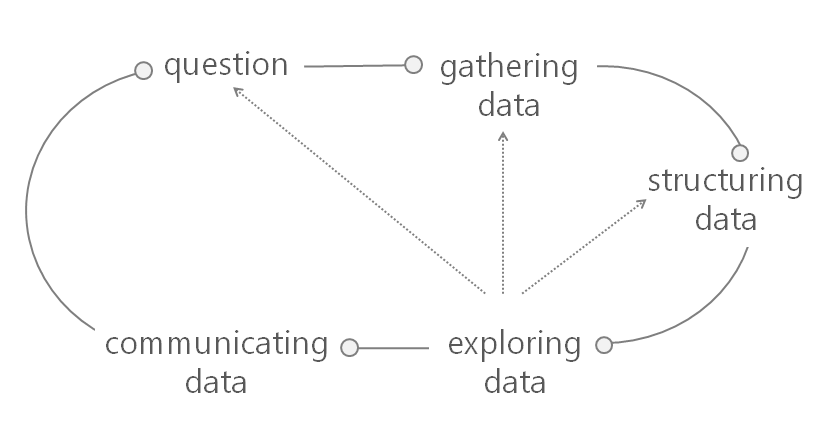
In Part 3, we describe the primary design principles upon which Tableau’s data blending feature was based. These principles were influenced by the application needs of Tableau’s end-user. In particular, we designed the blending system to be able to integrate datasets on-the-fly, be responsive to change, and driven by the visualization. Additionally, we assumed that the user may not know exactly what she is looking for initially, and needs a flexible, interactive system that can handle exploratory visual analysis.

Push Computation to Data and Minimize Data Movement

Tableau’s approach to data visualization allows users to leverage the power of a fast database system. Tableau’s VizQL algebra is a declarative language for succinctly describing visual representations of data and analytics operations on the data. Tableau compiles the VizQL declarative formalism representing a visual specification into SQL or MDX and pushes this computation close to the data, where the fast database system handles computationally intensive aggregation and filtering operations. In response, the database provides a relatively small result set for Tableau to render. This is an important factor in Tableau’s choice of post-aggregate data integration across disparate data sources – since the integrated result sets must represent a cognitively manageable amount of information, the data integration process operates on small amounts of aggregated, filtered data from each data source. This approach avoids the costly migration effort to collocate massive data sets in a single warehouse, and continues to leverage fast databases for performing expensive queries close to the data.

Automate as Much as Possible, but Keep User in Loop

Tableau’s primary focus has been on ease of use since most of Tableau’s end-users are not database experts, but range from a variety of domains and disciplines: business analysts, journalists, scientists, students, etc. This lead them to take a simple, pay-as-you-go integration approach in which the user invests minimal upfront effort or time to receive the benefits of the system. For example, the data blending system does not require the user to specify schemas for their data sets, rather the system tries to infer this information as well as how to apply schema matching techniques to blend them for a given visualization. Furthermore, the system provides a simple drag-and-drop interface for the user to specify the fields for a visualization, and if there are fields from multiple data sources in play at the  same time, the blending system infers how to join them to satisfy the needs of the visualization.

In the case that something goes wrong, for example, if the schema matching could not succeed, the blending system provides a simple interface for specifying data source relationships and how blending should proceed. Additionally, the system provides several techniques for managing the impact of dirty data on blending, which we discuss in more in Part 5 of this series.

Another Example: Patient Falls Dashboard [3]

NOTE: The following example is from Jonathan Drummey via the Drawing with Numbers blog site. The example uses Tableau v7, but at the end of the instructions on how he creates this dashboard in Tableau v7, Mr. Drummey includes instructions how the steps became more simplied in Tableau v8. I have included a reference to this blog post on his site in the reference section of my blog entry. The “I”, “me” voice you read in this example is that of Mr. Drummey.

As part of improving patient safety, we track all patient falls in our healthcare system, and the number of patient days – the total of the number of days of inpatient stays at the hospital. Every month report we report to the state our “fall rate,” a metric of the number of falls with injury for certain units in the hospital per 1000 patient days, i.e. days that patients are at the hospital. Our annualized target is to have less than 0.7 falls with injury per 1000 patient days.

A goal for our internal dashboard is to show the last 13 months of fall rates as a line chart, with the most recent fall events as a bar chart, in a combined chart, along with a separate text table showing some details of each fall event. Here’s the desired chart, with mocked-up data:


combo bars and lines

On the surface, blending this data seems really straightforward. We generate a falls rate very month for every reporting unit, so use that as the primary, then blend in the falls as they happen. However, this has the following issues:

  • Sparse Data – As I’m writing this, it’s March 7th. We usually don’t get the denominator of the patient days for the prior month (February) for a few more days yet, so there won’t be any February row of measure data to use as the primary to get the February fall events to show on the dashboard. In addition, there still wouldn’t be any March data to get the March fall events. Sometimes when working with blend, the solution is to flip our choices for the primary and secondary datasource. However, that doesn’t work either because a unit might go for months or years without a patient fall, so there wouldn’t be any fall events to blend in the measure data.
  • Falls With and Without Injury – In the bar chart, we don’t just want to show the number of patient falls, we want to break down the falls by whether or not they were falls with injury – the numerator for the fall rate metric – and all other falls. The goal of displaying that data is to help the user keep in mind that as important as it is to reduce the number of falls with injury, we also need to keep the overall number of falls down as well. No fall = no chance of fall with injury.
  • Unit Level of Detail – Because the blend needs to work at the per-unit level of detail as well as across all reporting units, that means (in version 7 at least) that the Unit needs to be in the view for the blend to work. But we want to display a single falls rate no matter how many units are selected.

Sparse Data

To deal with issue of sparse data, there are a few possible solutions:

  • Change the combined line and bar chart into separate charts. This would perhaps be the easiest, though it would require some messing about with filters, hidden reference lines, and continuous date axes to ensure that the two charts had similar axis ranges no matter what. However, that would miss out on the key capability of the combined chart to directly see how a fall contributes to the fall rate. In addition, there would be no reason to write this blog post. :)
  • Perform padding in the data source, either via a query/view or Custom SQL. In an earlier version of this project I’d built this, and maintaining a bunch of queries with Cartesian joins isn’t my favorite cup of tea.
  • Building a scaffold data source with all combinations of the month and unit and using the scaffold as the primary data source. While possible, this introduces maintenance issues when there’s a need for additional fields at a finer level of detail. For example, the falls measure actually has three separate fall rates – monthly, quarterly, and annual. These are generated as separate rows in our measures data and the particular duration is indicated by the Period field. So the scaffold source would have to include the Period field to get the data, but then that could be too much detail for the blended fall event data, and make for more complexity in the calculations to make sure the aggregations worked properly.
  • Do a tiny bit of padding in the query, then do the rest in Tableau via Show Missing Values aka domain padding. As I’d noted in an earlier post on blending, domain padding occurs before data is blended so we can pad out the measure data through the current date and then include all the falls. This is the technique I chose, for the reason that padding one row to the data is trivial and turning on Show Missing Values is a couple of mouse clicks. Here’s how I did that:

In my case, the primary data source is a Microsoft Access query that gets the falls measure results from a table that also holds results for hundreds of other metrics that we track. I created a second query with the same number of columns that returns Null for every field except the Measure Date, which has a value of 1/1/1900. Then a third query UNION’s those two queries together, and that’s what is used as the data source in Tableau.

Then, in Tableau, I added a calculated field called Date with the following formula:

//used for padding out display to today
IF [Measure Date] == #1/1/1900# THEN 
    TODAY() 
ELSE 
    [Measure Date] 
END

The measure results data contains a row per measure, reporting unit, and the period. These are pre-calculated because the data is used in a variety of different outputs. Since in this dashboard we are combining the results across units, we can’t just use the rate, we need to go back to the original numerator and denominator. So, I also created a new field for the Calculated Rate:

SUM([Numerator])/SUM([Denominator])

Now it’s possible to start building the line chart view:

  1. Put the Month(Date) – the full month/year version as a discrete – on Columns, Calculated Rate on Rows, Period on the Color Shelf. This only shows the data that exists in the data source, including the empty value for the current month (March in this case):


Screen Shot 2013-03-09 at 1.11.25 PM


  1. Turn on Show Missing Values for Month(Date) to start domain padding. Now we can see the additional column(s) for the month(s) – February in this case between January to the current month that Tableau has added in:


Screen Shot 2013-03-09 at 1.14.19 PM


With a continuous (green pill) date, this particular set-up won’t work in version 8. Tableau’s domain padding is not triggered when the last value of the measure is Null. I’m hoping this is just an issue with the beta, I’ll revise this section with an update once I find out what’s going on.

Even though the measure data only has end of month dates, instead of using Exact Date for the month I used Month(Date) because of two combined factors: One is that the default import of most date fields from MS Jet sources turns them into DateTime fields, the second is that Show Missing Values won’t work on an Exact Date for a DateTime field, you have to assign an aggregation to a DateTime (even Second will work). This is because domain padding at this level can create an immense number of new rows and cause Tableau to run out of memory, so Tableau keeps the option off unless you want it. Also note that you can turn on Show Missing Values for an Exact Date for a Date Field.

  1. Now for some cleanup steps: for the purposes of this dashboard, filter Period to remove Monthly (we do quarterly reporting), but leave in Null because that’s needed for the domain padding.
  2. Right-click Null on the Color Legend and Hide it. Again, we don’t exclude this because this would cause the extra row for the domain padding to fail.
  3. Set up a relative date filter on the Date field for the last 13 months. This filter works just fine with the domain padding.

Filtering on Unit

Here’s a complicating factor: If we add a filter on Unit, there’s a Null listed here:


Screen Shot 2013-03-09 at 1.18.31 PM

I’d just want to see the list of units. But if we filter that Null out, then we lose the domain padding, the last date is now January 2013:


Screen Shot 2013-03-09 at 1.18.58 PM


One solution here would be to alter the padding to add a padding row for every unit, instead of just one unit. Since Tableau doesn’t let us just hide elements in a filter, and we actually have more reporting units in our data than we are displaying on the dashboards, I chose to use a parameter filter because there are more reporting units in our production data than we are displaying on the dashboards, yet the all-unit rate needs to include all of the data. Setting this up included a parameter with All and each of the units, and a calculated field called “Chosen Unit Filter” with the following formula, that is set to Filter on False:

[Choose Unit] == "All" OR [Choose Unit] == [Unit]

Falls With and Without Injury

In a fantasy world, to create the desired stacked bars I’d be able to drag the Number of Records from the secondary datasource, i.e. the number of fall events, drag an Injury indicator onto the Color Shelf, and be done. However, that runs into the issue of having a finer level of detail in the secondary than in the primary, which I’ll walk through solutions for in the next section. In this case, since there are only two different numbers, the easy way is to generate two separate measures, then use Measure Names/Measure Values to create the stacked bars – Measure Values on Rows, and Measure Names on the Color Shelf. Here’s the basic calculation for Falls with Injury:

SUM(IF [Injury] != "None" THEN 1 ELSE 0 END)

We’re using a row-level calculated field to generate the measure, and a slightly different calc for Falls w/out Injury.

Unit Level of Detail

When we want to blend in Tableau at a finer level of detail and aggregate to a higher level, historically there have been three options:

  • Don’t use blending at all, instead use a query to perform the “blend” outside of Tableau. In the case that there are totally different data sources, this can be more difficult but not impossible by using one of the systems or a different system to create a federated data source, for example by adding your Oracle table as an ODBC connection to your Excel data, then making the query on that. In this case, we don’t have to do that.
  • Use Tableau’s Primary Groups feature “push” the detail from the secondary into the primary data source. This is a really helpful feature, the one drawback is that it’s not dynamic so any time there are new groupings in the secondary it would have to be re-run. Personally, I prefer automating as much as possible so I tend not to use this technique.
  • Set up the view with the needed dimensions in the view – on the Level of Detail Shelf, for example – and then use table calculations to do the aggregation. This is how I’ve typically built this kind of view.

Tableau version 8 adds a fourth option:

  • Tell Tableau what fields to blend on, then bring in your measures from the secondary.

I’ll walk through the table calculation technique, which works the same in version 7 and version 8, and then how to take advantage of v8′s new feature.

Using Table Calculations to Aggregate Blended Data

In order to blend the the falls data at the hospital unit level to make sure that we’re only showing falls for the selected unit(s), the Unit has to be in the view (on the Rows, Columns, or Pages Shelves, or on the Marks Card). Since we don’t actually need to display the Unit, the Level of Detail Shelf is where we’ll put that dimension. However, just adding that to the view leads to a bar for each unit, for example for April 2012 one unit had one fall with injury and another had two, and two units each had two falls without injury.


Screen Shot 2013-03-09 at 1.30.27 PM


To control things like tooltips (along with performance in some cases), it’s a lot easier to have a single bar for each month/measure. To do that, we turn to a table calculation, here’s the Falls w/Injury for v7 Blend calculated field, set up in the secondary data source:

IF FIRST()==0 THEN
	TOTAL([Falls w/Injury])
END

This table calculation has a Compute Using of Unit, so it partitions on the Month of Date. The IF FIRST()==0 part ensures that there is only one mark per partition. I’m using the TOTAL() aggregation here because it’s easier to set up and maintain. The alternative is to use WINDOW_SUM(), but in Tableau prior to version 7 there are some performance issues, so the calc would be:

IF FIRST()==0 THEN
	WINDOW_SUM(SUM(Falls w/Injury]), 0, IIF(FIRST()==0,LAST(),0))
END

The ,0 IIF(FIRST()==0,LAST(),0 part is necessary in version 7 to optimize performance, you can get rid of that in version 8.

You can also do a table calculation in the primary that accesses fields in the secondary, however TOTAL() can’t be used across blended data sources, so you’d have to use the WINDOW_SUM version.

With a second table calculation for the Falls w/out Injury, now the view can be built, starting with the line chart from above:

  1. Add Measure Names (from the Primary) to Filters Shelf, filter it for a couple of random measures.
  2. Put Measure Values on the Rows Shelf.
  3. Click on the Measure Values pill on Rows to set the Mark Type to Bar.
  4. Drag Measure Names onto the Color Shelf (for the Measure Values marks).
  5. Drag Unit onto the Level of Detail Shelf (for the Measure Values marks).
  6. Switch to the Secondary to put the two Falls for v7 Blend calcs onto the Measure Values Shelf.
  7. Set their Compute Usings to Unit.
  8. Remove the 2 measures chosen in step 1.
  9. Clean up the view – turn on dual axes, move the secondary axis marks to the back, change the axis tick marks to integers, set axis titles, etc.

This is pretty cool, we’re using domain padding to fill in for non-existent data and then having a blend happening at one level of detail while aggregating to another, just for the second axis. Here’s the v7 workbook on Tableau Public:

Patient Falls Dashboard - Click on Image to go to Tableau Public

Patient Falls Dashboard – Click on image above to go to Tableau Public

Tableau Version 8 Blending – Faster, Easier, Better

For version 8, Tableau made it possible to blend data without requiring the linking fields in the view. Here’s how I build the above v7 view in v8:

  1. Add Measure Names (from the Primary) to Filters Shelf, filter it for a couple of random measures.
  2. Put Measure Values on the Rows Shelf.
  3. Click on the Measure Values pill on Rows to set the Mark Type to Bar.
  4. Drag Measure Names onto the Color Shelf (for the Measure Values marks).
  5. Switch to the Secondary and click the chain link icon next to Unit to turn on blending on Unit.
  6. Drag the Falls w/Injury and Falls w/out Injury calcs onto the Measure Values Shelf.
  7. Remove the 2 measures chosen in step 1.
  8. Clean up the view – turn on dual axes, move the secondary axis marks to the back, change the axis tick marks to integers, set axis titles, etc.

The results will be the same as v7.

Next: Tableau’s Data Blending Architecture

—————————————————————-

References:

[1] Kristi Morton, Ross Bunker, Jock Mackinlay, Robert Morton, and Chris Stolte, Dynamic Workload Driven Data Integration in Tableau, University of Washington and Tableau Software, Seattle, Washington, March 2012, http://homes.cs.washington.edu/~kmorton/modi221-mortonA.pdf.

[2] Hans Rosling, Wealth & Health of Nations, Gapminder.org, http://www.gapminder.org/world/.

[3] Jonathan Drummey, Tableau Data Blending, Sparse Data, Multiple Levels of Granularity, and Improvements in Version 8, Drawing with Numbers, March 11, 2013, http://drawingwithnumbers.artisart.org/tableau-data-blending-sparse-data-multiple-levels-of-granularity-and-improvements-in-version-8/.


Filed under: Data Blending, Kristi Morton, MicroStrategy, Tableau

An Introduction to Data Blending – Part 5 (Tableau’s Data Blending Architecture)

$
0
0

Readers:

In Part 4 of this series on data blending, we reviewed Tableau’s Data Blending Principles. We also reviewed an example of data blending in Jonathan Drummey’s Patient Falls Dashboard. [3]

Today, in Part 5 of this series, we will peel the onion a bit more and look at Tableau’s Data Blending Architecture.

Again, much of Parts 1 – 5 are based on a research paper written by Kristi Morton from The University of Washington (and others) [1].

You can learn more about Ms. Morton’s research as well as other resources used to create this blog post by referring to the References at the end of the blog post.

Best Regards,

Michael

Integrating Data in Tableau

In Part 5, we discuss in greater detail how data blending works. Then we discuss how a user builds visualizations using data blending using several large datasets involving airline statistics.

Data Blending Architecture

Part 5 - Figure 1

The data blending system, shown in Figure 1 above, takes as input the VizQL query workload generated by the user’s GUI actions and data source schemas, and automatically infers how to query the data sources remotely and combine their results on-the-fly. The system features a two-tier mediator-based architecture in which the VizQL query workload is analyzed and partitioned at runtime based on the corresponding data source fields being used. The primary mediator initiates this process by removing the visual encodings from the VizQL query workload to yield an abstract query. The abstract query is partitioned for further processing by the primary mediator and one or more secondary mediators. The primary mediator creates the mediated schema for the given query workload. It then federates the abstract queries to the primary data source as well as the secondary mediators and their respective data sources. The wrappers compile the abstract queries into concrete SQL or MDX queries and instantiate the semantic mappings between the data sources and the mediated schema for each query. The primary mediator joins all the result sets returned from all data sources to produce the mediated result set used by the rendering system. [1]

Part 5 - Figure 2

Post-aggregate Join

A visualization is organized by its discrete fields into pages, partitions, colors, etc., and like a GROUP BY clause in SQL, these grouping fields comprise the primary key of the visualization. In a blended visualization, the grouping fields from the primary data source become the primary key of the mediated schema. In Figure 2 above, these are shown as the dark-green fields in the primary data source, and the light green fields represent the aggregated data. Each secondary data source must contain at least one field that matches a visualization grouping field in order to blend into the mediated schema. The matching fields in a secondary data source comprise its join key, and fields appear in the GROUP BY clause issued by the secondary mediator wrappers. The aggregated data from the secondary data source, shown in light-purple, is then left-joined along its join key into the mediated result set. Morton (et al) refer to this left-join of aggregated result sets as a post-aggregate join. [1]

Primary Key Cardinality

many mapping between the domain values of the primary key and those of the secondary join key, because the secondary join key is a subset of the primary key and contains only unique values in the aggregated secondary result set. Morton (et al) find that this approach is the most natural for augmenting a visualization with secondary data sources of uncertain value or quality, which is a common scenario for Tableau users.

Data blending supports many-to-one relationships between the primary and each secondary. This can occur when the secondary data source contains coarser-grained data than the mediated result set, as discussed in Part 3 of this series.

Since the join key in a secondary result set may match a subset of the blended result set primary key, portions of the secondary result set may be duplicated across repeated values in the mediated result set. This does not pose risk of double-counting measure values, becaused all aggregation is performed prior to the join. When a blended visualization uses multiple secondary data sources, each secondary join key may match any subset of the primary key. The primary mediator handles duplicating each secondary result set as needed to join with the mediated result set.

Finally, a secondary dimension which is not part of the join key (and thus not a grouping field in the secondary query) can still be used in the visualization. If it is functionally dependent on the join key, a secondary dimension can be used without affecting the result set cardinality. Tableau references this kind of non-grouping dimension using both MIN and MAX aggregations in the query issued to the secondary data source, which allows Tableau to determine if the dimension is functionally dependent on the join key. For each row in the secondary result set, if the two aggregated values are the same then the value is used as-is, reflecting the functional dependence on the grouping fields. If the aggregated values differ, Tableau represents the value using a special form of NULL called ManyValues. This is represented in the visualization as a ‘*’, but retains the behavior of NULL
when used in calculated fields or other computations. The visual feedback allows a user to distinguish this lack of data from the NULLs which occur due to missing or mismatched data.

Inferring Join Keys

Tableau uses very simple rules for automatically detecting candidate join keys:

  1. The secondary data source field name must match a field with the same name in the primary data source.
  2. The data types must match
  3. If they are date/time fields, they must represent the same granularity date bin in the date/time hierarchy, e.g. both are MONTH. A user can intervene to force a match either by providing field captions to rename fields within the Tableau data model, or by explicitly defining a link between fields using a simple user interface.

Part 5 - Figure 3

Another Simple Blending Example

A Tableau data blending scenario is shown in Figure 3 above, which includes multiple views that were composed in minutes by uniquely mashing up four different airline datasets, the largest of which include a 324 million row ticket pricing database and a 140 million row on-time performance database. A user starts by dragging fields from any dataset on to a blank visual canvas, iteratively building a VizQL statement which ultimately produces a visualization. In this example, the user first drags the VizQL fields, YEAR(Flight Date) and AVG(Airfare), from the pricing dataset onto the visual canvas.

Data blending occurs when the user adds fields from a separate dataset to an existing VizQL statement in order to augment their analysis. Tableau assigns the existing dataset to the primary mediator and uses secondary mediators to manage each subsequent dataset added to the VizQL. The mediated schema has a primary key composed of the grouping VizQL fields from the primary dataset (e.g. YEAR(Flight Date)); the remaining fields in the mediated schema are the aggregated VizQL fields from the primary dataset along with the VizQL fields from each secondary dataset.

Continuing our example, the user wishes to drag AVG(Total Cost per Gallon) from the fuel cost dataset to the visualization. The schema matching algorithm examines
the secondary dataset for one or more fields whose name exactly matches a field in the primary key of the mediated schema. While the proposed matches are often sufficient and acceptable, the user can specify an override. Since the fuel cost dataset has a field named Date, the user provides a caption of Flight Date to resolve the schema discrepancy. At this point the mediated schema is created and the VizQL workload is then federated to the wrappers for each dataset. Each wrapper compiles VizQL to SQL or MDX for the given workload, executes the query, and maps the result set into the intermediate form expected by the primary mediator.

The mapping is performed dynamically, since both the VizQL and the data model evolve during a user’s iterative analytical workflow. Finally, the primary mediator
performs a left-join of each secondary result set along the primary key of the mediated schema. In this example, the mediated result set is rendered to produce the visualization shown in Figure 3(a).

Evolved Blending Example

Figure 3(b) above shows further evolution of the analysis of airline datasets, and demonstrates several key points of data blending. First, the user adds a unique ID field named unique carrier from the primary dataset to the VizQL to visualize results for each airline ID over time. The mediated schema adapts by adding this field to its primary key, and the secondary mediator automatically queries the fuel cost dataset at this finer granularity since it too has a field named uniquecarrier. Next, the user decorates the visualization with descriptive airline names for each airline ID by dragging a field named Carrier Name from a lookup table.

This dataset is at a coarser granularity than the existing mediated schema, since it does not represent changes to the carrier name over time. Morton’s (et al) system automatically handles this challenge by allowing the left-join to use a subset of the mediated result set primary key, and replicating the carrier name across the mediated result set. Figure 4 below demonstrates this effect using a tabular view of a portion of the mediated result set, along with portions of the primary and secondary result sets.

The figure also demonstrates how the left-join preserves data for years which have no fuel cost records. Last, the user adds average airline delays from a 140 million row dataset which matches on Flight Date and uniquecarrier. This is a fast operation, since the wrapper performs mapping operations on the relatively small, aggregated result set produced by the remote database. Note that none of these additional analytical tasks required the user to intervene in data integration tasks, allowing their focus to remain on finding insight in the data.

Part 5 - Figure 4

Filtering

Tableau provides several options for filtering data. Data may be filtered based on aggregate conditions, such as excluding including airlines having a low total count of flights. A user can filter aggregate data from the primary and secondary data sources in this fashion, which results in rows being removed from the mediated result set. In contrast, row level filters are only allowed for the primary data source. To improve performance of queries sent to the secondary data sources, Tableau will filter the join keys to exclude values which are not present in the domain of the primary data source result set, since these values would be discarded by the left-join.

Data Cleaning Capabilities

As mentioned in the Inferring Join Keys section above, Tableau supports user intervention in resolving field names when schema matching fails. And once the schemas match and data is blended, the visualization can help provide feedback regarding the validity of the underlying data values and domains. If there are any data inconsistencies, users can provide aliases for a field’s data values which will override the original values in any query results involving that field. The primary mediator performs a left-join using the aliases of the data values, allowing users to blend data despite discrepancies from data entry errors and spelling variations. Tableau provides a simple user interface for editing field aliases. Calculated fields are another aspect of Tableau’s data model which support data cleaning. Calculated fields support arbitrary transformations of original data values into new data values, such as trimming whitespace from a string or constructing a date from an epoch-based integer timestamp.

As with database fields, calculated fields can be used as primary keys or join keys.

Finally, Tableau allows users to organize a field’s related data values into groups. These ad-hoc groups can be used for entity resolution, such as binding multiple variations of business names to a canonical form. Ad-hoc groups also allow constructing coarser-grained structures, such as grouping states into regions. Data blending supports joins between two ad-hoc groups, as well as joins between an ad-hoc group and a string field.

Next: Data Blending Using MicroStrategy

———————————————————————————-

References:

[1] Kristi Morton, Ross Bunker, Jock Mackinlay, Robert Morton, and Chris Stolte, Dynamic Workload Driven Data Integration in Tableau, University of Washington and Tableau Software, Seattle, Washington, March 2012, http://homes.cs.washington.edu/~kmorton/modi221-mortonA.pdf.

[2] Hans Rosling, Wealth & Health of Nations, Gapminder.org, http://www.gapminder.org/world/.

[3] Jonathan Drummey, Tableau Data Blending, Sparse Data, Multiple Levels of Granularity, and Improvements in Version 8, Drawing with Numbers, March 11, 2013, http://drawingwithnumbers.artisart.org/tableau-data-blending-sparse-data-multiple-levels-of-granularity-and-improvements-in-version-8/.


Filed under: Analytics, Data Blending, Kristi Morton, MicroStrategy, Tableau, VizQL

An Introduction to Data Blending – Part 6 (Data Blending using MicroStrategy)

$
0
0

Readers:

In Part 5 of this series on data blending, we reviewed Tableau’s Data Blending Architecture. With Part 5, I have wrapped up the Tableau portion of this series.

I am now going to post, over the next week or so, several parts discussing how we do data blending using MicroStrategy. Fortunately, MicroStrategy just publish a nice technical note on their Knowledgebase (TN Key: 46940) [1] discussing this. Most of what I am sharing today is derived from that technical note.

I probably will have 2-4 parts for this topic in my Data Blending series including how the MicroStrategy Analytical Engine deals with multiple datasets.

I want to thank Kristi Morton (et al) for the wonderful research paper she wrote at The University of Washington [2]. It helped me provide some real insight into the topic and mechanics of data blending, particularly with Tableau. You can learn more about Ms. Morton’s research as well as other resources used to create this blog post by referring to the References at the end of the blog post.

So let’s now dig into how MicroStrategy provides us data blending capabilities.

Best Regards,

Michael

Data Blending using MicroStrategy

In Part 6, we will begin examining using data blending in MicroStrategy. We will first look at how to use attributes from multiple datasets in the same Visual Insight dashboard and link them to existing attributes using the Data Blend feature in MicroStrategy Analytics Enterprise Web 9.4.1.

Prior to v9.4.1 of MicroStrategy, data blending was referred to as Cube Joining.

In MicroStrategy Analytics Enterprise Web 9.4.1, the new Report Services Documents Engine automatically links common attributes using the modeled schema whenever possible. The manual linking is not allowed between different modeled attributes. Just in case the requirement needs to link different attributes, this can be done by using MicroStrategy Architect at the schema level. The join behavior by default for linking related attributes is done using a full outer join. In case there is no relationship between the attributes, then a cross join is used.

The manual attribute linking can be done as shown in the images below.

Part 6 - 1


2. Browse the file to match the existing data and select Continue.

Part 6 - 2


3. Set the attribute forms if needed. MicroStrategy will automatically assign the detected ones.

Part 6 - 3

4. The attributes can be mapped manually by selecting Link to Project Attribute.

Part 6 - 4

5. Select the attribute form that matches the desired join:

Part 6 - 5

6. The attribute should appear similar to the ones existing in the schema as shown below.

Part 6 - 6


7. Save the recently created dataset.

Part 6 - 7

8. Now there are two cubes used as datasets in the same Visual Insight dashboard, as shown below.

Part 6 - 7a

Automatic Linking

The attributes icons now have a blue link, as shown below. This indicates that MicroStrategy has automatically linked them to elements in the Information dataset.

Part 6 - 8

Next: How Data Blending Affects the Analytical Engine’s Behavior in MicroStrategy

———————————————————————————-

References:

[1] MicroStrategy Knowledgebase, How to use attributes from multiple datasets in the same Visual Insight dashboard and link them to existing attributes using the Data Blend feature in MicroStrategy Analytics Enterprise Web 9.4.1, TN Key: 46940, 04/24/2014, https://resource.microstrategy.com/support/mainsearch.aspx.

NOTE: You may need to register to view MiroStrategy’s Knowledgebase.

[2] Kristi Morton, Ross Bunker, Jock Mackinlay, Robert Morton, and Chris Stolte, Dynamic Workload Driven Data Integration in Tableau, University of Washington and Tableau Software, Seattle, Washington, March 2012, http://homes.cs.washington.edu/~kmorton/modi221-mortonA.pdf.


Filed under: Data Blending, MicroStrategy, Tableau

Bryan’s BI Blog: MicroStrategy vs Tableau

Small Multiples, Tableau and Ben Jones

$
0
0

Readers:

My BI world is changing a bit as I move more towards using Cognos and Tableau at work. In particular, I have a lot of status reports and dashboards to create for my leadership and I have been doing these mostly in Tableau.

I had a situation recently where I wanted to create a small multiples chart versus using a 3D Bar Chart that already existed. I have created small multiples charts fairly easily in Ben JonesMicroStrategy in my previous work, but have never created one before in Tableau. I reached out to Ben Jones (photo, right) at Tableau. I have been a big fan of Ben’s DataRemixed blog for quite some time and have blogged about Ben many times in the past. Ben was gracious enough to create a simple example small multiples chart for me to use to accomplish what I wanted to visualize. I was really impressed that Ben and Tableau did not put me through any red tape for him to help me. He saw I had a need and he helped me.

Much thanks to Ben for his help and I hope this example is useful to you.

Best Regards,

Michael

Small Multiples

Edward TufteA small multiple (sometimes called trellis chart, lattice chart, grid chart, or panel chart) is a series or grid of small similar graphics or charts, allowing them to be easily compared. The term was popularized by data visualization pioneer, Edward Tufte.

According to Tufte (Envisioning Information, p. 67):

At the heart of quantitative reasoning is a single question: Compared to what? Small multiple designs, multivariate and data bountiful, answer directly by visually enforcing comparisons of changes, of the differences among objects, of the scope of alternatives. For a wide range of problems in data presentation, small multiples are the best design solution.

A Small Multiples Example by Andrew Gelman

One of the most well-known examples of the use of small multiples is Andrew Gelman’s analysis of public support for vouchers, broken down by religion/ethnicity, income, and state (see image below).

GelmanMr. Gelman is a professor of statistics and political science and director of the Applied Statistics Center at Columbia University. His books include Bayesian Data Analysis (with John Carlin, Hal Stern, David Dunson, Aki Vehtari, and Don Rubin), Teaching Statistics: A Bag of Tricks (with Deb Nolan), Data Analysis Using Regression and Multilevel/Hierarchical Models (with Jennifer Hill), Red State, Blue State, Rich State, Poor State: Why Americans Vote the Way They Do (with David Park, Boris Shor, and Jeronimo Cortina), and A Quantitative Tour of the Social Sciences (co-edited with Jeronimo Cortina).

Andrew has done research on a wide range of topics, including: why it is rational to vote; why campaign polls are so variable when elections are so predictable; why redistricting is good for democracy; reversals of death sentences; police stops in New York City, the statistical challenges of estimating small effects; the probability that your vote will be decisive; seats and votes in Congress; social network structure; arsenic in Bangladesh; radon in your basement; toxicology; medical imaging; and methods in surveys, experimental design, statistical inference, computation, and graphics.

[Click on Image to Enlarge]

Gelman Voucher Map Using Small Multiples

My Small Multiples Chart

Since I cannot show you what I used the small multiples chart for related to my job, I made an illustrative, simple example related to home sales in different regions for the past six months. Below is an example of my chart, which I created using Tableau.

[Click on Image to Enlarge]

Home Sales Small Multiples

Adding Trend Lines

One of the key features I wanted to use in my chart was to be able to show trend lines for each small multiple.

However, when I clicked on Trend Lines -> Show Trend Lines, I kept getting the following error message:

Trend Lines Error Message Panel

Ben pointed out that in my original chart, the Columns shelf, Month needed to be a Continuous data type (green pill) rather than a Discrete data type (blue pill).  If you click in the Month pill, you should be able to select “Change to Continuous” and then you should be able to add a trend line. This occurs because you can only calculate a trend line when two axes are involved. The way I had it set up, the Columns were just different categories or attributes, rather than continuous measures.

I thought this would be a nice tip to pass along.

I hope to be able to share more Tableau tips as I become more proficient with the tool.


Filed under: Ben Jones, Charts, Data Visualization, Edward Tufte, Small Multiples, Tableau

Jock Mackinlay and Tableau’s Research Team is Building Tomorrow’s UX for Data

$
0
0

Readers:

I thought I would present some interesting information visualization research being conducted at Tableau Software by Jock Mackinlay (photo, right) and his research team.Jock Mackinlay. Source: Tableau Software

Mr. Mackinlay is an information visualization expert and Vice President of Visual Analysis at Tableau Software. With Stuart K. Card, George G. Robertson and others he invented a number of Information Visualization techniques. [1] Mr. Mackinlay, joined Tableau in 2004 after 18 years specializing in data visualization at Xerox PARC.

Tableau Software was born of academic research, and as the company continues to grow, it is building an R&D division to help build a pipeline of innovation. Jock, who heads up the research team, explains how it works and what his team is working on.

I cite references (most of this blog post is based on Derrick Harris’ interview with Mr. Mackinlay in Gigaom) after this blog post for those of you who want to delve deeper into what Jock’s team is doing.

Best regards,

Michael

Tableau Software and Their Research Culture

Tableau LogoTableau Software is many things: a fast-growing thorn in the side of legacy analytics vendorsstock-market gold and the poster child for the next generation of user-friendly data analysis, among them. It’s also a company with a deeply rooted and growing research culture that’s responsible for nearly everything users see when they open its popular visualization application. [2]

Tableau itself is the product of a Stanford Ph.D. dissertation by co-founder and Chief Development Officer Chris Stolte, in conjunction with his then-professor and eventual co-founder Pat Hanrahan. Their project, called Polaris, combined a structured query language with a declarative language for describing data visualization. When they commercialized the research by founding Tableau, that combination – which came together into a technology called VizQL – became the defining feature of the drag-and-drop Tableau experience.

However, the true value of what Stolte and Hanrahan created wasn’t just that let it let mainstream users query data visually and generate graphs, said Mackinlay. There had been a lot of research around ideal ways to visualize data — including his own — but they often focused on customized views of a single problem or type of analysis.“The real power [of Tableau] was to go through a bunch of different views to answer one question,” Mackinlay said. “All you have to be an expert at is your data and the questions you want to ask of it.”

The new research division within Tableau (technically, it was really created about a year and a half ago) is trying to imagine and create the next set of technologies that change the way data analysis is done. The five-person team, which Mackinlay heads, consists of four visualization experts (including Mackinlay), a couple of whom are also specialize in statistics and one of whom specializes in high-performance computing. The fifth member specializes in natural-language processing and computer graphics.

Like most research divisions, the team writes academic papers and works on some projects that might not be applicable for years, but Mackinlay made it pretty clear that the researchers expect everything they’re doing could be commercialized. If there was one thing that separated the famous Bell Labs from Xerox PARC or even Microsoft Research, it’s that Bell was really good at doing really good research that made its way into products, he said. Good research labs need to find the middle ground between nearsighted product upgrades and pie-in-the-sky ideas and, he explained, “You have to have absolutely no gap between the research scientists … and the people who are actually doing the work.”

A still image of an interactive Story Points slideshow. Source: Tableau Public user Matt Francis

Research Leads to Tableau Story Points Feature

Robert-Kosara-Tableau-Software-200x200It’s at a much, much smaller scale than Bell Labs, but Mackinlay thinks Tableau is following down that right path. For example, he said, the Story Points feature in the latest release of the company’s software, allows users to create data slideshows, was the result of tight work between the product team and researcher Robert Kosara (photo, right), who had been doing research into this area for years. As data volumes, dataset complexity and user sophistication all increase, Mackinlay said systems-level research into data processing (including how to optimize for increased client-side computing power) has and will continue to help deliver a smooth user experience.He’s understandably less forthcoming about what, specifically, we can expect to see from Tableau in the near term, but Mackinlay did discuss a few areas of interest. One is making it easier to use aesthetically pleasing icons rather than text labels in charts, an area where he and colleague Vidya Setlur (the aforementioned NLP and graphics specialist) recently published a paper. He’s also interested in text analysis and NLP, and generally adding new types of visualizations — some of which those types of analysis will help enable. For example, “node-link diagrams” (aka graphswill happen, he said, although he can’t put an exact data on when.icons

Mackinlay also suggested that Tableau might expand beyond its current product lineup, which is essentially the same software delivered via the desktop (free and paid), server or cloud. “We can make our existing products easy to use,” Mackinlay said. “We can also make new products that are easy to use — perhaps radically easier than our existing products.”

Although the word “easy” is kind of a misnomer, it’s one that’s used to describe Tableau and other user-friendly software quite often. “Easy” connotes shallowness, Mackinlay said, making an analogy to the evolution of the telephone. Phones have evolved a great deal from those where users just rang the operator, to rotary phones, and now to modern smartphones. With every iteration, manufacturers had to strike the right balance maintaining a recognizable experience but also adding more capabilities.

“We use the two words ‘simple’ and ‘useful,’” he said. “… If you don’t make sure you’re useful, people just aren’t going to stick with you.”

—————————————————————————–

References

[1]  Jock D. Mackinlay, Wikipedia.com, http://en.wikipedia.org/wiki/Jock_D._Mackinlay.

[2] Derrick Harris, A tiny research team at tableau is building tomorrow’s UX for data, Gigaom, July 7, 2014, http://gigaom.com/2014/07/07/a-tiny-research-team-at-tableau-is-building-tomorrows-ux-for-data/.


Filed under: Data Visualization, Gigaom, Jock Mackinlay, Robert Kosara, Tableau, UX
Viewing all 292 articles
Browse latest View live